Art Direction: Drew Gonzalez, Soonduk Krebs
Tequila Colorada is a distinguished tequila company based in Arandas, Jalisco, known for producing versatile tequila flavors with a remarkably smooth finish. The company's ideology is deeply rooted in family history, which is intricately woven into the brand's identity. This project holds personal significance for me, as it also reflects my own family history. Additionally, my craft cocktail lounge "MAS," which embodies the same values and dedication to quality, can be found on my website.
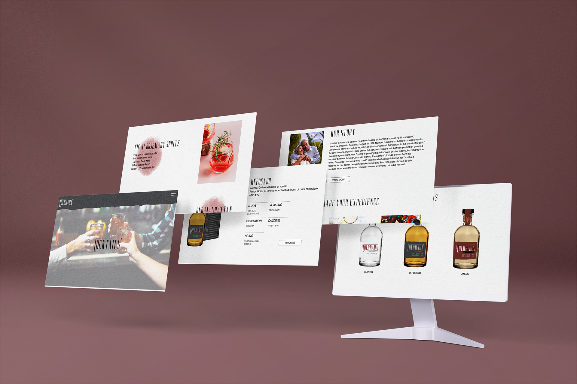
OUR STORY
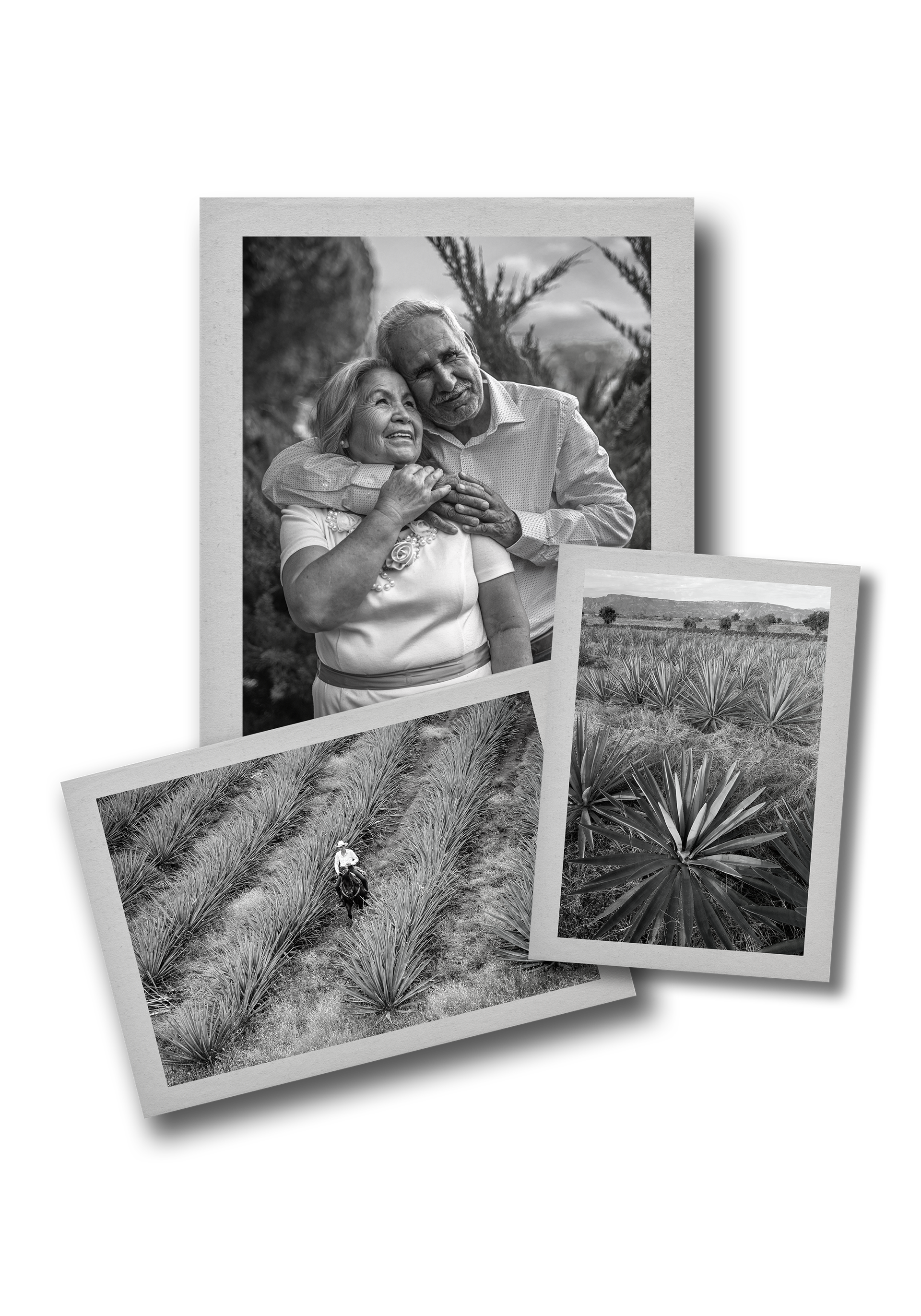
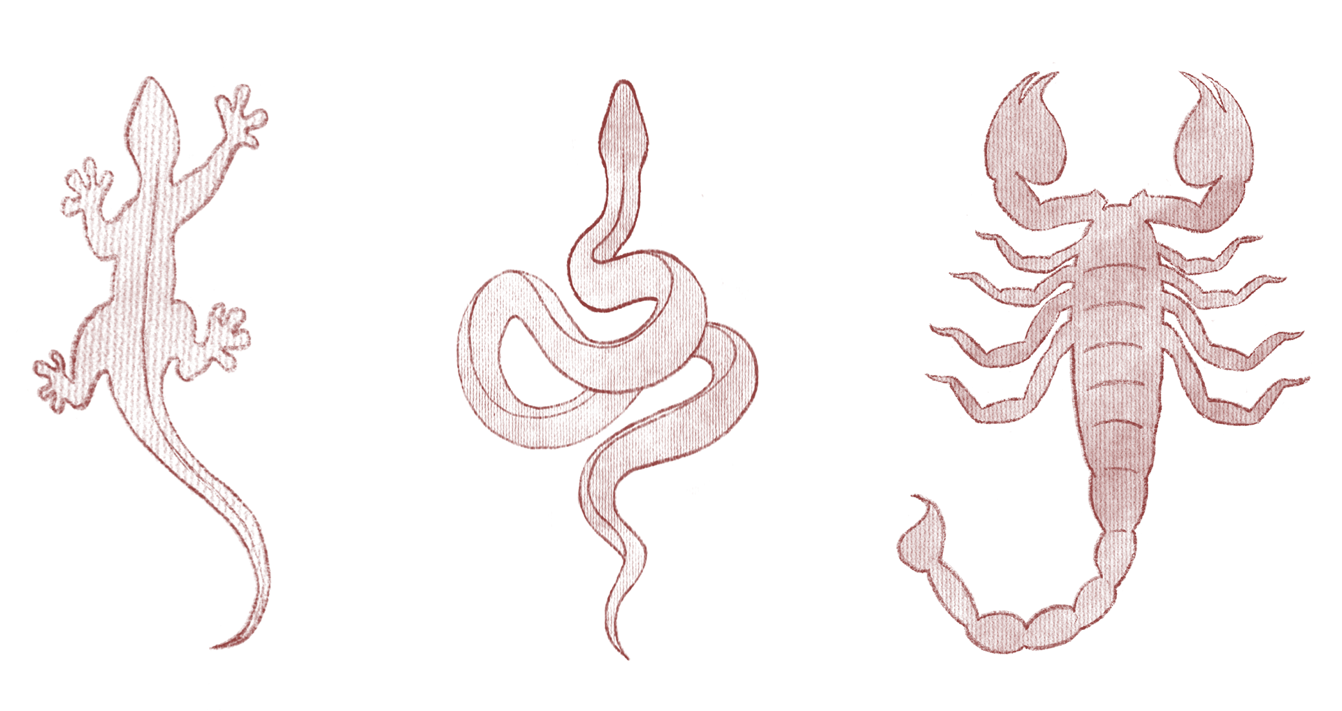
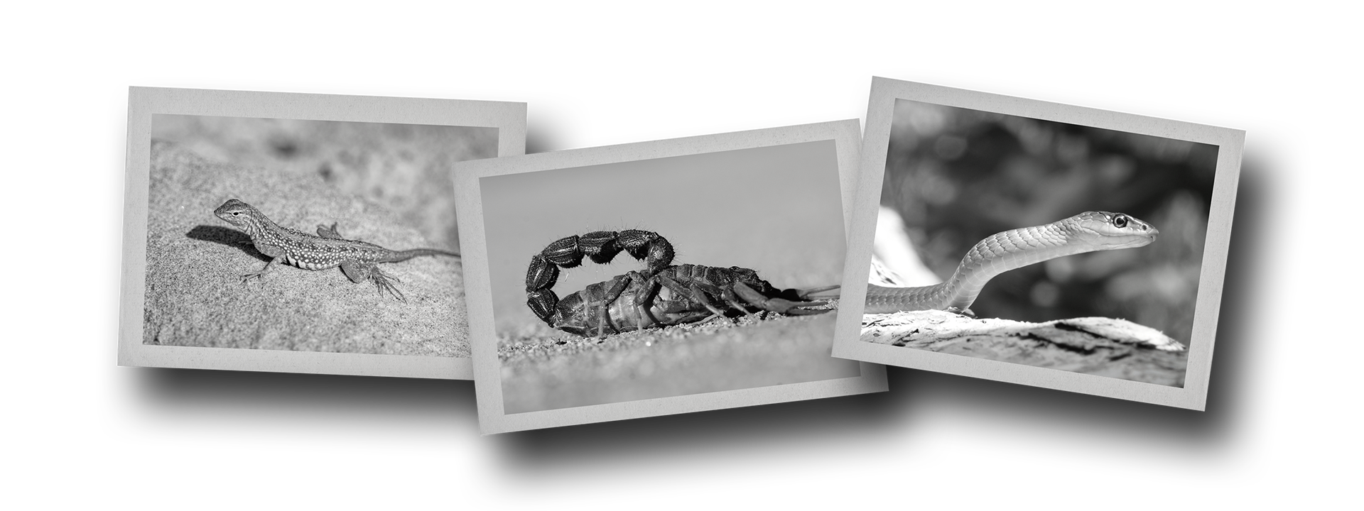
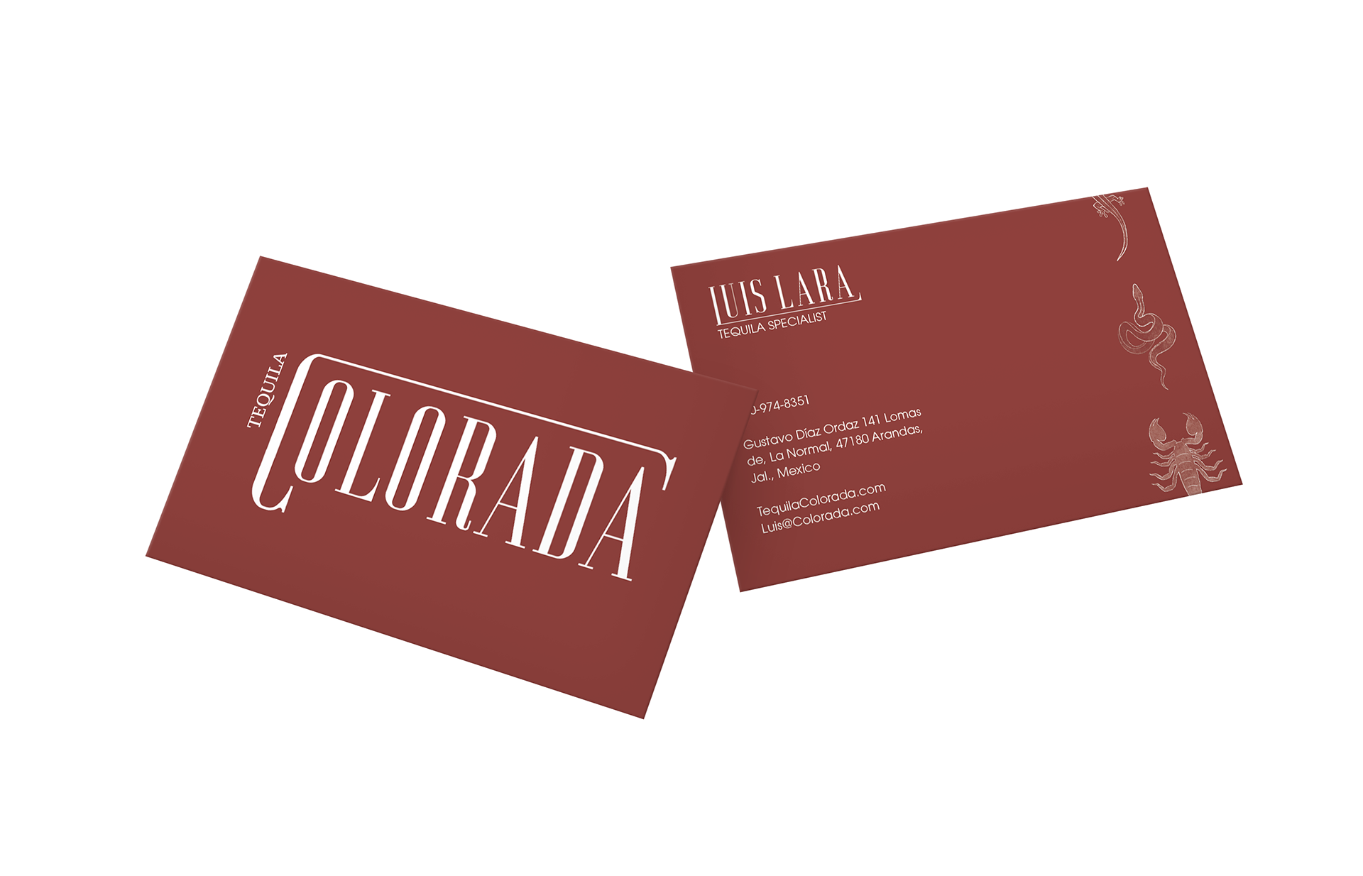
Crafted in Arandas, Jalisco, on a twenty acre plot of land named “El Nacimiento”, the story of Tequila Colorada began. In 1972, founder Luis Lara embarked on a journey to create one of the smoothest tequilas known to mankind. Being born in the “Land of Tequila”, he saw the opportunity to take advantage of the rich, red colored soil that was perfect for growing the blue agave plant. After 7 years of growing his first harvest of blue agave, he created the very first bottle of Tequila Colorada Blanco. The name Colorada comes from the “Tierra Colorada” meaning “Red Land”, which is what Jalisco is known for. Our three mascots for our bottles being the Snake, Lizard and Scorpion were chosen by Luis because those were the three creatures he saw every day out in his harvest fields.
BEHIND THE CREATURES
LA LAGARTIJA
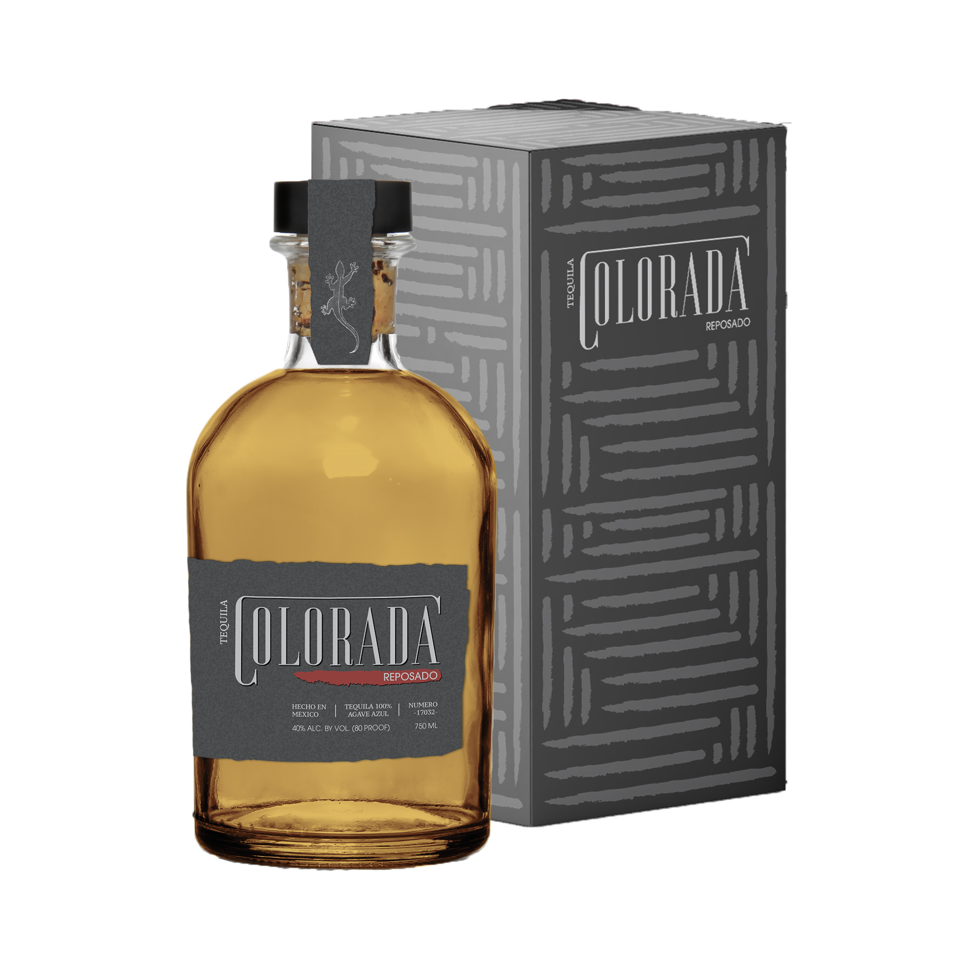
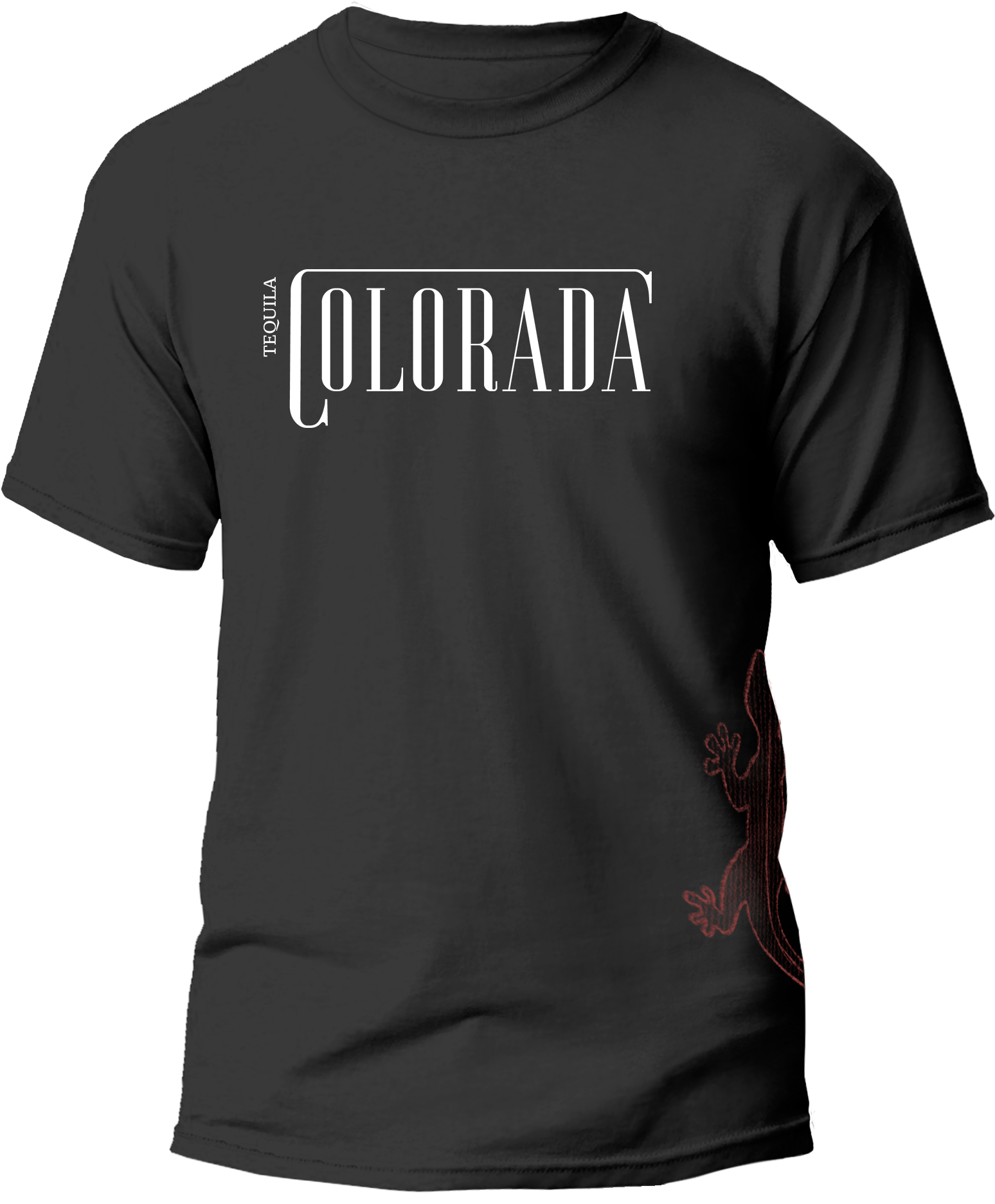
“La Lagartija” means lizard in Spanish and represents one of the creatures that Luis saw out in the harvest fields. Being the fastest of the three creatures, aside from collecting these creatures, kids all over Mexico hunt lizards as an activity. Now as an adult, Luis sees these creatures as a big part of his childhood and watches them run across his harvest fields daily. La lagartija was chosen for Reposado because of it’s quickness. The deep flavor of chocolate is strong but quick on the tongue, along with the aroma of vanilla.
LA CULEBRA
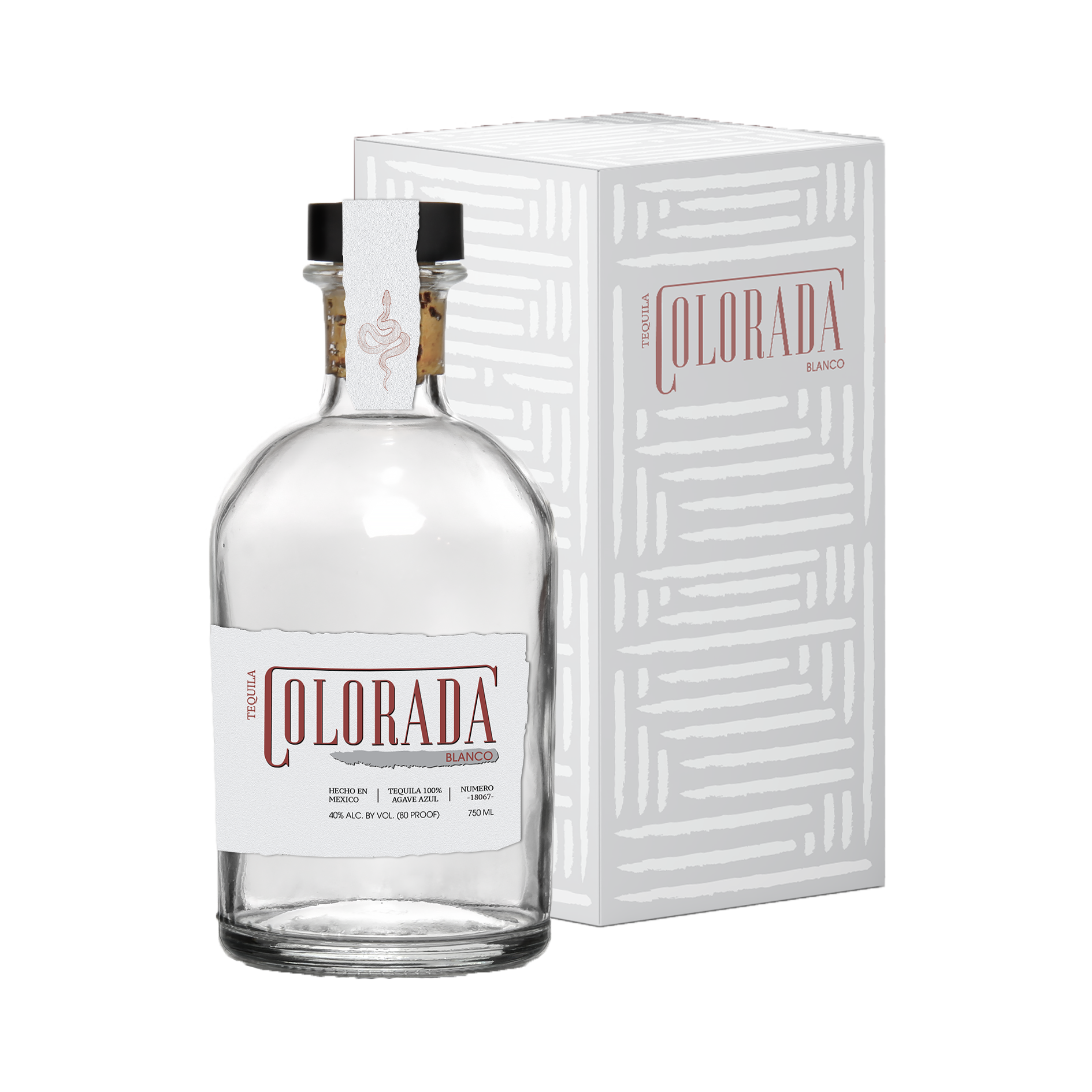
“La Culebra” means snake in Spanish and it was chosen to represent Colorada because ever since Luis was a child, he would hang out with his friends and they would catch creatures and it was always a race to see who could catch the best creature. There were three main creatures to catch with the snake being one of them. The snake was surprisingly not too hard to catch, but it was hard to find! La culebra was chosen for Blanco because of the surprise you get when you find one. Much like the surprise of how easy and smooth our Blanco tequila goes down.
EL ALACRAN
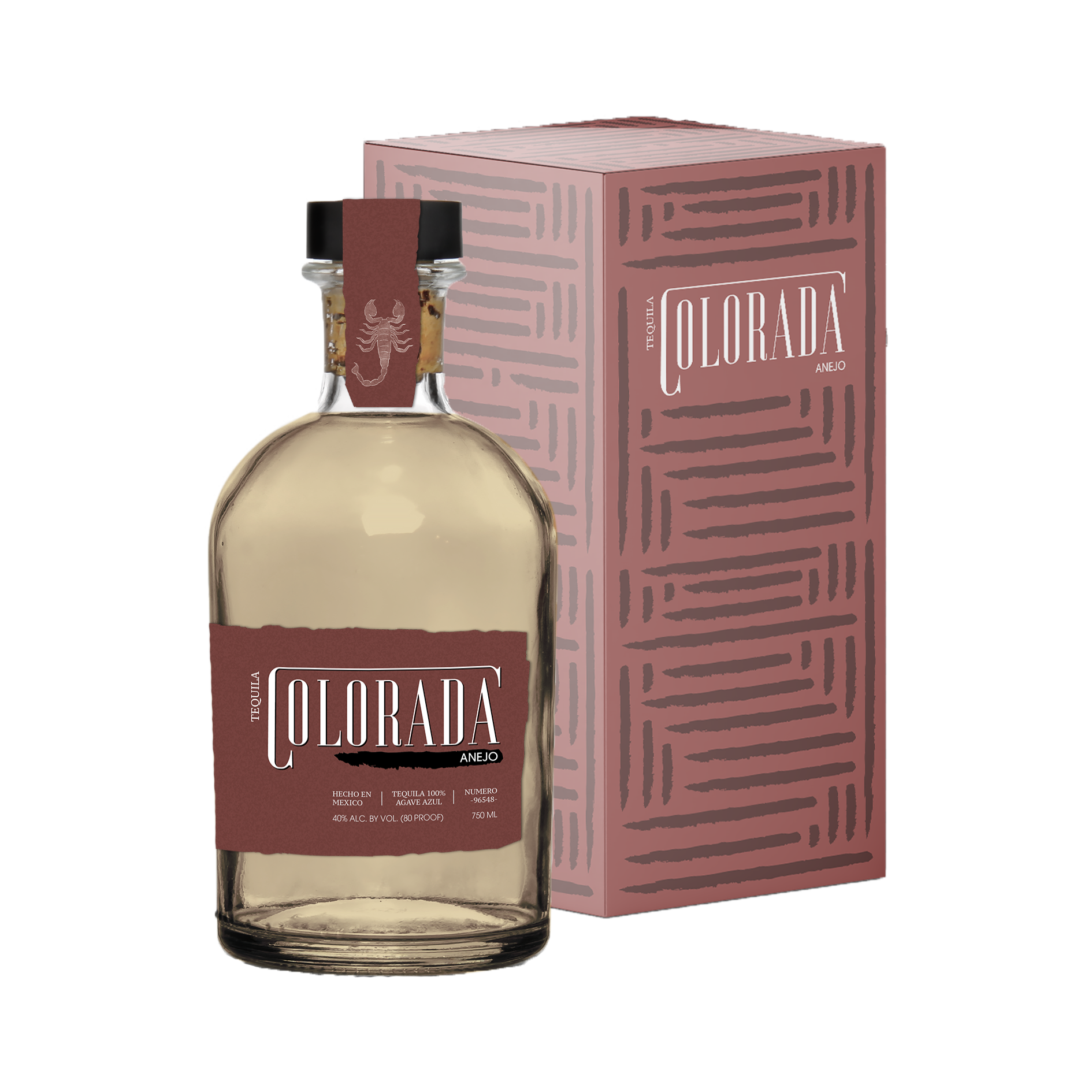
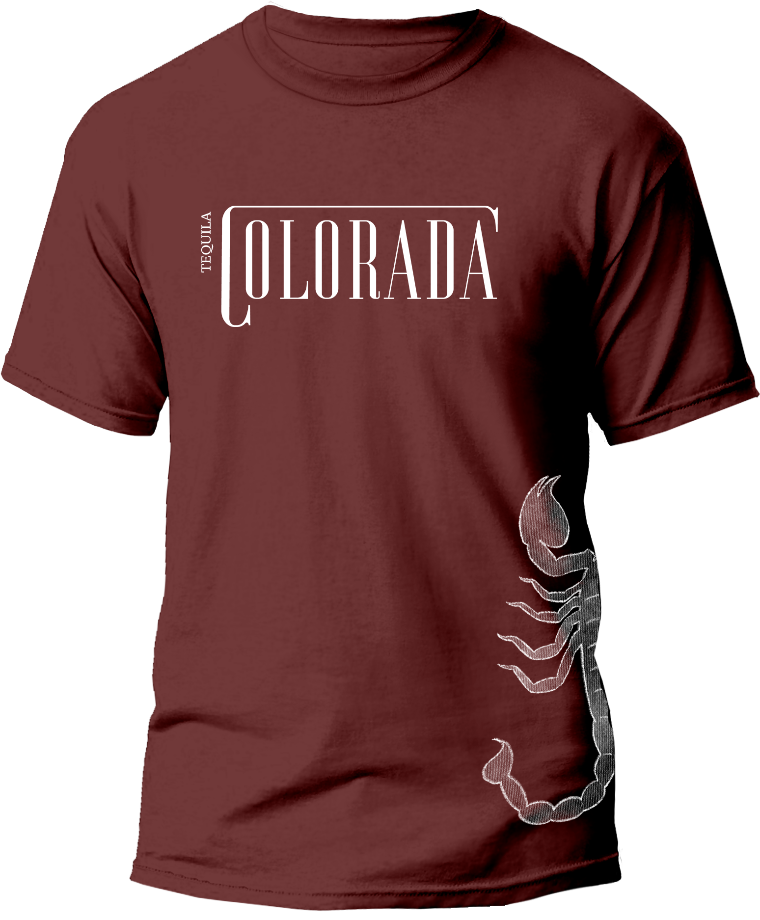
“El Alacran” means scorpion in Spanish and is the last of the three creatures. Luis chose the scorpion as his last creature because of how aware and feisty they can get. Luis couldn’t leave the scorpion out of his brand story because of one specific experience when him and his friends found a whole nest of scorpions and they made the mistake of messing with it. Naturally, with how feisty these creatures can be, they all got stung. El alacran was chosen for Anejo because it is closely tied to the feistiness and spice of our tequila.
BEGINNING JOURNEY
JOURNEY TO TEQUILA
During the brainstorming process for this project, I was drawn to creating a tequila brand because it resonates with my ancestors and family history. My family hails from Jalisco, Mexico, the heartland of tequila, with a rich history of owning and working on agave farms. This connection made it easy to develop a compelling narrative and generate creative ideas, inspired by my visits to family and memories of the agave farms.
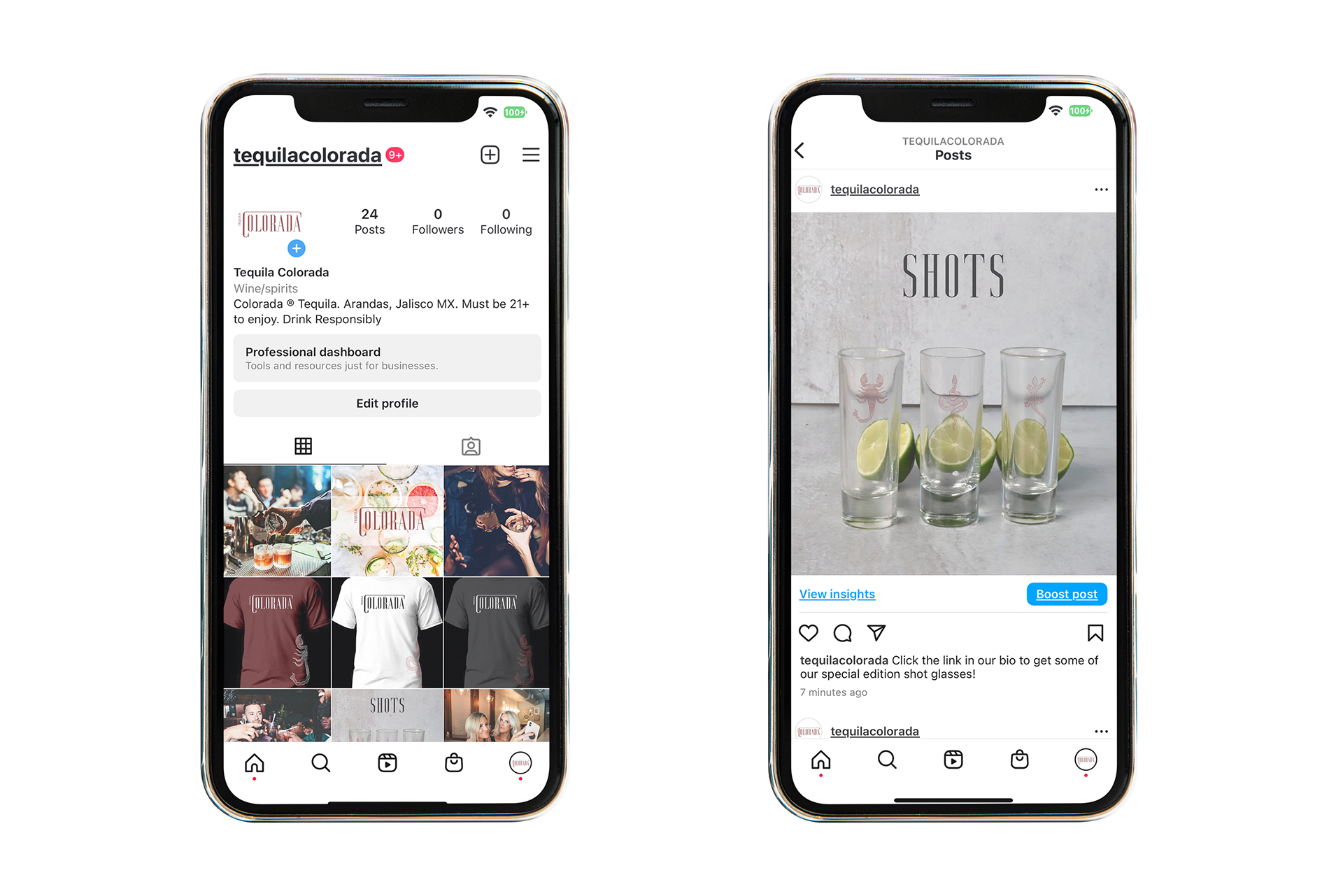
I envisioned a sleek and simple aesthetic with a burst of energy from a torn-edge design, which is prominently featured on the label and throughout the brand. Later in the process, I incorporated illustrations that enhanced the brand's unique character and made it feel even more special. Creating the website design was my favorite part, as it brought the entire brand together cohesively and showcased the story and essence of Tequila Colorada.
BEHIND THE BOX DESIGN
Since the name derives from the red colored land where tequila is made, the box design came from the idea of an aerial view of the blue agave farms and the poetic pattern they create with perfect line placement.
OBSTACLES ON MY JOURNEY
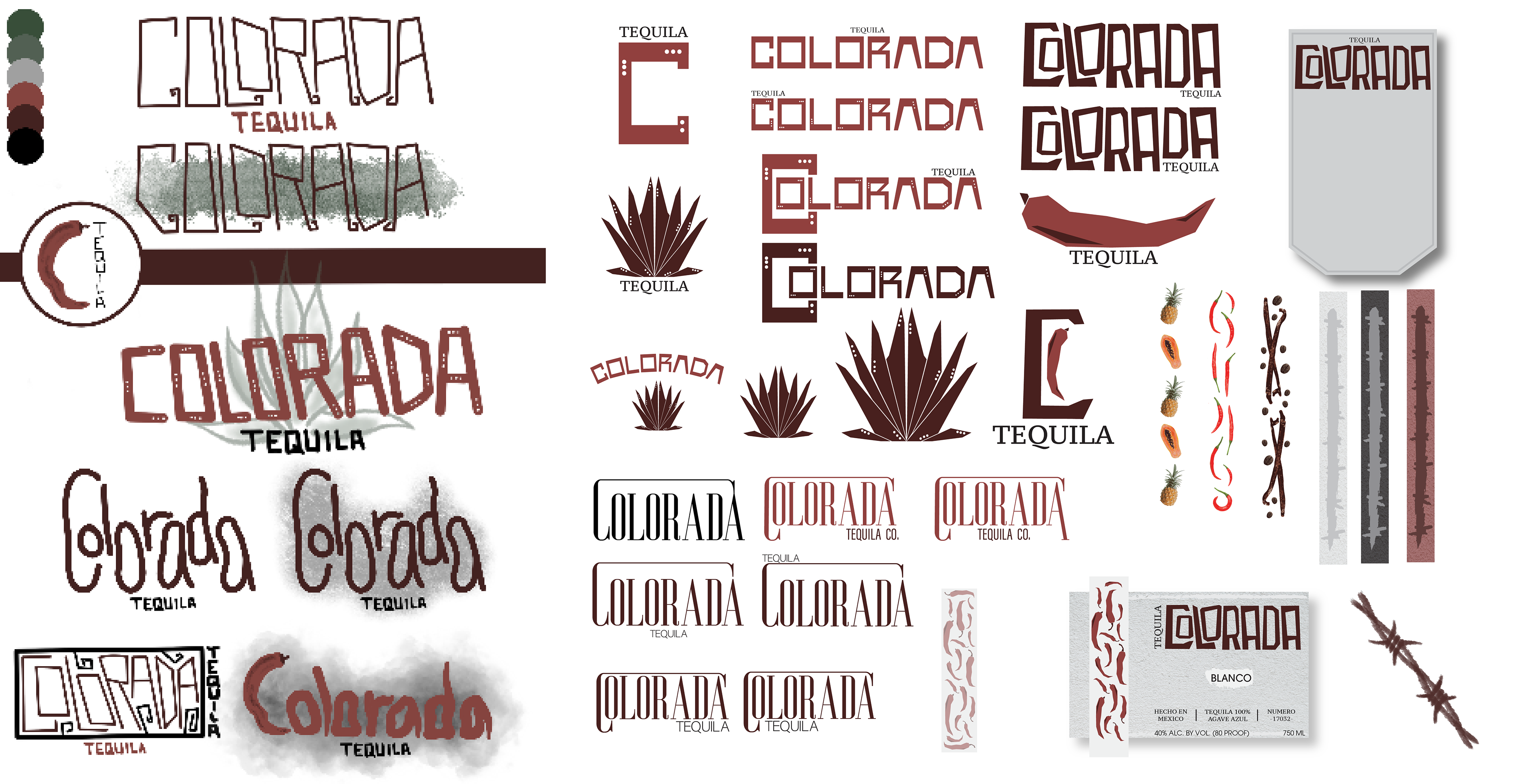
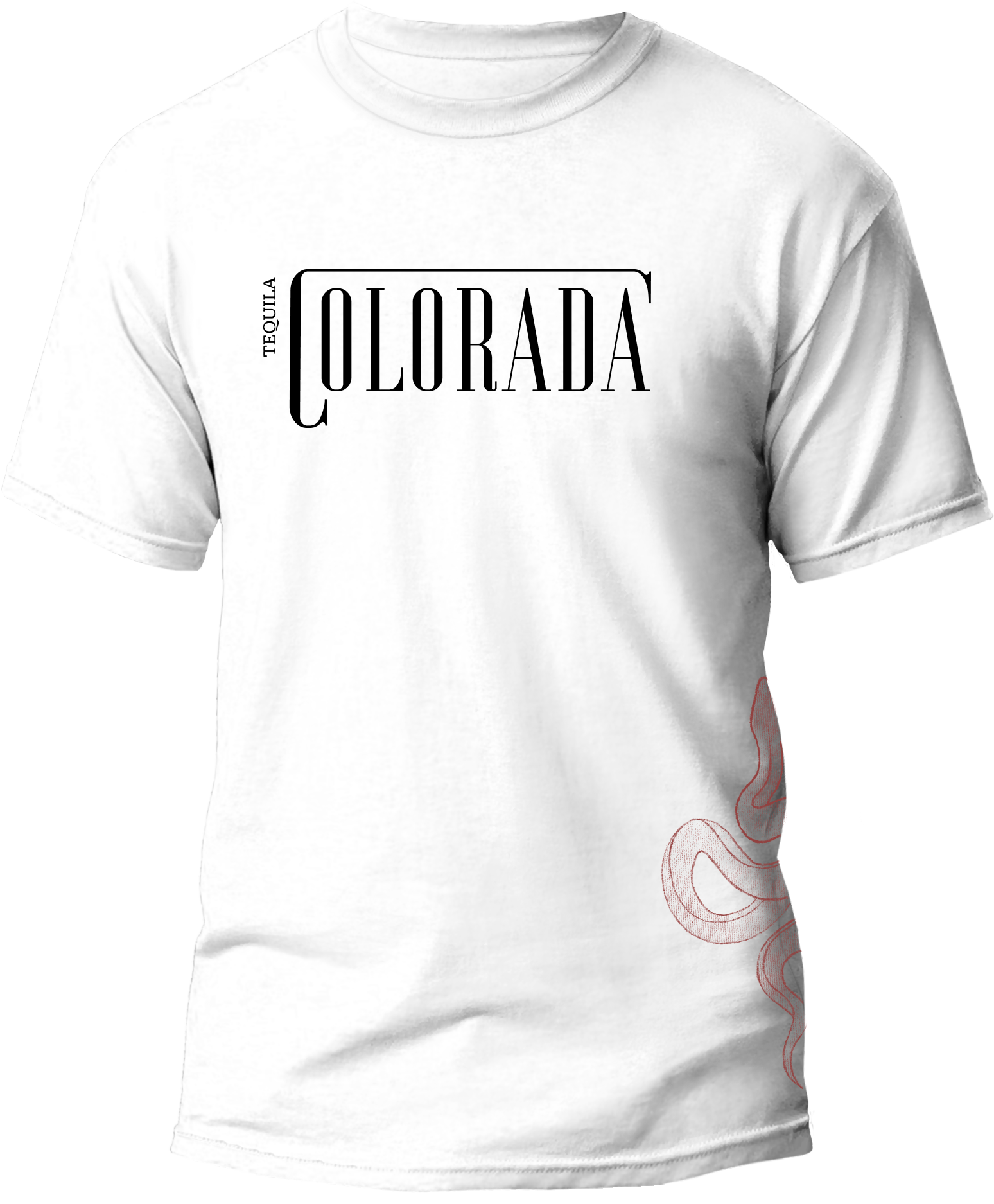
When creating the brand identity for Tequila Colorada, I began with the logo, aiming for a clean, type-based design. Choosing the right font to match the desired aesthetic was challenging, but I ultimately settled on a serif font. By adjusting the kerning for better balance and stretching the first letter of "Colorada" to encase the rest of the word, the logo achieved a refined and sophisticated look.
The most significant creative hurdle was designing the bottle label, which took the longest to perfect. I overcame this by stepping outside my comfort zone and creating unique illustrations for each bottle, drawing inspiration from childhood memories of visiting family in Mexico. These illustrations introduced a set of creatures and their stories, adding depth and cultural richness to the brand.
Whenever I faced creative blocks, I revisited the idea of connecting the brand to my cultural heritage, ensuring cohesion and authenticity. This approach ultimately brought all elements together, making the brand identity of Tequila Colorada feel both personal and polished.
ONLY THE BEGINNING
While I am ecstatic with the way this Tequila brand turned out, I would like to expand this brand and create a Tequila seltzer product line to go hand in hand with the brand and market the company to a different audience that likes something a little more bubbly. Seltzers are a popular and growing business in the alcoholic beverage industry and reaching that target audience would only expand the brand and gain more popularity. The idea for the Tequila seltzers would be that they would be called “Spiked Aguas Frescas” and the 4 initial flavor names would be “Lima Limon”, “Pica Pepino”, “Jalisco Jamaica”, and “Mucho Mango”, which all connect back to well known Mexican aguas frescas flavors.